Fonts and Code
The other day I had a thought: just how much does using monospaced fonts improve our ability to read and write code?
Now, practically speaking, I would say there are only benefits to using a monospaced font: things line up nicely, characters never squish together making it hard to distinguish the presence of a punctuation character, and similar characters like 1 and l are generally given distinct markings.
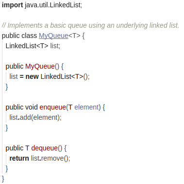
That being said, I can’t say I don’t think that other types of fonts wouldn’t be fun to try. So I did. First, I made a little queue class that wraps LinkedList to get a taste for how things would look.

There were 2 things that came to my attention while making this:
- Maybe I’m not fully awake yet, but it was hard to focus while writing it.
- As a whole, it doesn’t look that bad.
I think that number 1 was no coincidence. My theory is this: I strongly associate monospaced font with code. My brain sees a monospaced font and subconsciously prepares itself to be in ‘code mode’. When I instead see a proportional font, I head into general-purpose ‘reading mode’. However, I quickly realize that I am indeed looking at code, and everything screeches to a halt as these two tendencies battle it out.
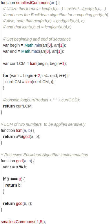
As for number 2, this is a pretty small snippet, so maybe something larger will make it harder to read. This is a JavaScript function that I wrote a little while ago as part of the Free Code Camp curriculum.

…I have to say, things aren’t looking too great. The biggest issue that I have reading this code is how ‘flattened’ the code gets horizontally. To be fair, I generally indent by spaces, and only use 2 at that, but even the code itself looks compressed and unnaturally close.
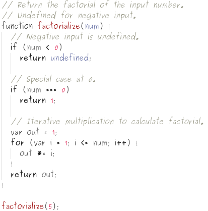
While there are certainly some negative aspects, it is pretty mentally exciting to see the code dressed up in such different clothes. In fact, I think its worth taking things a step further, and picking out some really excellent threads.

Maybe it’s not the easiest thing to read if you actually needed to maintain it, but I actually really like this one - it looks like a picture of some handwritten code, and generally leaves me feeling very comfortable.
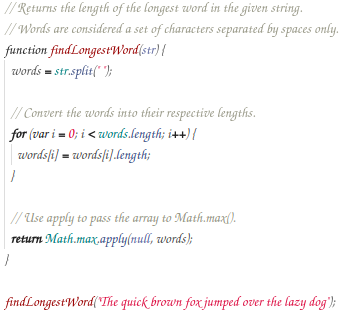
Finally, I present code of the highest form and beauty: a script font. Feast your eyes.

Even if it hurts your head, you have to admit, it is quite pretty.